As someone who often works with formatted data I have a giant pet peeve with how people use spreadsheets. I have to get this off my chest so I’m going to do it here.
I’m signing up for the Rainier to Ruston Relay at the end of may. The website helpfully provides a spreadsheet that lists the geocodes for all the relay stations. This this is what it looks like:
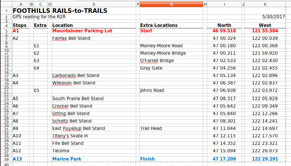
See how someone has put little spacer columns and rows in there? Columns B, D, F, etc. and about every other row? This is all in the service of, I guess making it look nicer when it’s printed or something.
Don’t do this! 

There is useful data in there but it’s much harder to do anything with it because of all those empty cells. For example, If I copy the cells in my spreadsheet program and paste here, I get this:
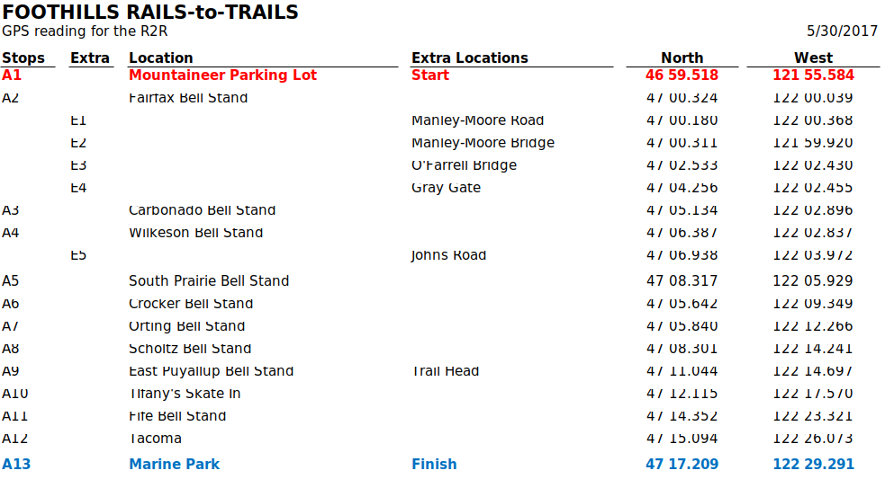
It looks…kinda crappy. A lot of the numbers are cut off. The biggest problem though is it gets rendered as an image. Try to copy the data from one of the rows in that table. Don’t try too hard though because you can’t do it. It’s an image. Not only can you not copy text from it, search crawlers (like the one on this site) or screen readers can’t either. Also, it won’t adjust itself for different screen sizes. You are stuck with one size and aspect ratio. Good luck viewing that on your phone.
So, how should you format your spreadsheet data? Glad you asked.
Ideally, you should format data with the column names on the first row and nothing but data in all the rows below. Don’t skip rows or columns. If you want to space things or make lines use the formatting features in your spreadsheet program. Here’s the data reformatted properly
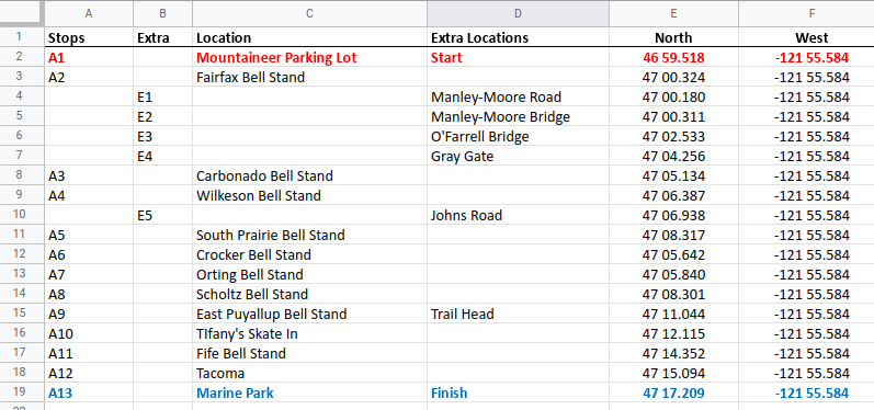
I can feel my blood pressure dropping just looking at that! 
Look what happens when I copy that and paste it below:
| Stops | Extra | Location | Extra Locations | North | West |
|---|---|---|---|---|---|
| A1 | Mountaineer Parking Lot | Start | 46 59.518 | -121 55.584 | |
| A2 | Fairfax Bell Stand | 47 00.324 | -121 55.584 | ||
| E1 | Manley-Moore Road | 47 00.180 | -121 55.584 | ||
| E2 | Manley-Moore Bridge | 47 00.311 | -121 55.584 | ||
| E3 | O’Farrell Bridge | 47 02.533 | -121 55.584 | ||
| E4 | Gray Gate | 47 04.256 | -121 55.584 | ||
| A3 | Carbonado Bell Stand | 47 05.134 | -121 55.584 | ||
| A4 | Wilkeson Bell Stand | 47 06.387 | -121 55.584 | ||
| E5 | Johns Road | 47 06.938 | -121 55.584 | ||
| A5 | South Prairie Bell Stand | 47 08.317 | -121 55.584 | ||
| A6 | Crocker Bell Stand | 47 05.642 | -121 55.584 | ||
| A7 | Orting Bell Stand | 47 05.840 | -121 55.584 | ||
| A8 | Scholtz Bell Stand | 47 08.301 | -121 55.584 | ||
| A9 | East Puyallup Bell Stand | Trail Head | 47 11.044 | -121 55.584 | |
| A10 | TIfany’s Skate In | 47 12.115 | -121 55.584 | ||
| A11 | Fife Bell Stand | 47 14.352 | -121 55.584 | ||
| A12 | Tacoma | 47 15.094 | -121 55.584 | ||
| A13 | Marine Park | Finish | 47 17.209 | -121 55.584 |
It’s no longer an image. It looks different, but it’s the same data and now everything is text. You can select rows. You can do things like change the font size. You can even copy it into your own spreadsheet. Try it. Open your spreadsheet program (Excel or Sheets or whatever), copy that table above and paste it into a sheet. It just works, and now you have the data that you can use to do something like generate google map links to those coordinates, for example.
An HTML table like this is also better than providing a link to a spreadsheet file because I don’t have to open some other program (which might not be installed on my computer or phone) to see the data.
This has been a public service announcement of Stan’s Data Services. Thank you for your attention. Please don’t get me started on how people (mis)use Microsoft Word.