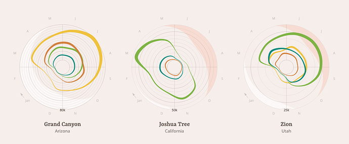
This is a neat visualization of the usage of all the US National Parks.
The month is shown around the circle. Each concentric circle is 5000 nights. The colored rings represent different types of accommodation (lodging, tent, backcountry, etc.). The white and red regions show low and high average temperatures.
It really is an efficient way to show lots of information in a simple diagram.
